Field Name | Description |
Title |
Font | Choose font type from the drop-down |
Font Size | Enter the font size by moving up or down the arrow |
Font Weight | Choose font-weight from the drop-down. |
Font Color | Choose font color by clicking on the color palette |
Alignment | Choose the alignment for the title. You can align the title left, right, or center. |
Line Style | Choose the line style from the drop-down for the line below the title. You can also specify the length, thickness, color for a particular line style. |
Tabs > Font & Alignment You can edit Tabs only if you choose Carousel with tabs template type. |
Font | Choose the font for the tab from the drop-down. |
Font Size | Select font size by moving up or down the arrow |
Alignment | Choose the alignment for the title. You can align the tab left, right, or center. |
Tabs > Font Weight The active tab refers to the tab currently being used. The inactive tab refers to any other open tabs. |
Active | Choose the font-weight for the active tab from the drop-down. |
Inactive | Choose the font-weight for the inactive tab from the drop-down. |
Tabs > Font Color |
Active | Choose the font color for the active tab from the color palette. |
Inactive | Choose the font color for the inactive tab from the color palette |
Tabs > Tabs Highlight Color |
Active | Choose the tab highlight color for the active tab from the color palette. |
Inactive | Choose the tab highlight color for the inactive tab from the color palette. |
Layout > Properties |
Number of Columns | Specify the number of columns to include in a carousel. |
Product Image Source | Choose the product image link from the drop-down. The drop-down values are obtained from the catalog. The default value is image_url. You can choose to include a high-resolution image, a small image, or any image you have specified in the catalog. |
Product Details | Select product details to be included below the product image. By default, title and price are included. To add more product details, click +. You can specify a maximum of 4 product details. |
| Grid > Layout > Properties |
| Manual | Manually select the number of rows and columns per page from the drop-down. |
| Calculate based on area | Automatically calculate and display grid based on the available space. You can specify the Maximum width of the product cards and the Number of displayed rows per page. |
| Lazy Loading | Click Lazy Loading to defer the images in the template from loading, until it is in viewport of the user. You can provide a placeholder image to be displayed until the actual image is loaded. Lazy loading improves the initial page load time while decreasing the bandwidth consumption. |
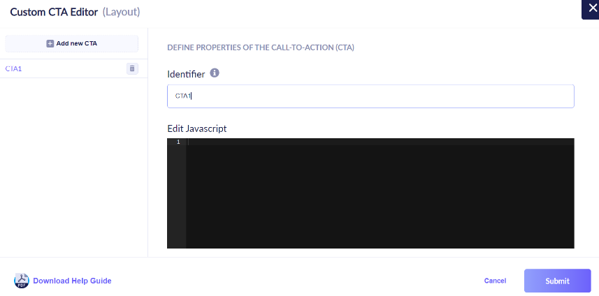
| Custom CTA | Click Add New CTA to add a new Call To Action button. You can edit the Javacript to define the properties of the CTA and add as many as custom CTAs as required. For example, you can customize a CTA to trigger actions such as Add To Cart or Add To Wishlist. This Javascript code will be executed when the module is rendered on your site, enabling custom events and actions. |
| Grid > Layout > Pagination |
| Infinite Scroll | Select Infinite Scroll from the drop-down to enable a long page scroll without a limit. |
| Call-To-Action (CTA) | Select Call-To-Action (CTA) from the drop-down to display the configured CTA. |
Image Tags Optional. Text or dynamic values to be displayed on the product image. For example, if you want to highlight or promote a product, you can include tags such as “New’’, ”Sale”, “10% off” to be displayed on top of the product image. To add an image tag, click +. We recommend adding a maximum of only two image tags. |
Image Tag Identifier
| Enter a name for your image tag. |
Customize Image Tag to be displayed
| There are three ways to specify an image tag: |
Conditions | You can set filtering rules to identify products on which the image tag should be displayed. |
Layout > Style > Image |
Border | Choose the border style around the product image from the drop-down. |
Border Color | Choose the border color from the color palette |
Thickness | Choose the border thickness by moving up or down the arrow. |
Layout > Style > Product Details Click on each product detail to edit the formatting style. |
Font | Choose font type from the drop-down |
Font Size | Select font size by moving up or down the arrow |
Font Weight | Choose font-weight from the drop-down |
Font Color | Choose font color by clicking on the color palette |
Alignment | Choose the alignment for the title. You can align the text left, right, or center. You can also choose to trim the product detail text to a single line or display the complete text. |
Layout > Style > Carousel Icon Carousel icons are navigation arrows on the side that enable you to slide through the carousel manually. |
Icon Style | Display style of the carousel navigation arrows. You can choose from one of the following icon styles:
  
|
Icon Background Select Icon Background to edit the background color for the navigation arrow. Active Icon refers to the current navigation arrow being used. Inactive Icon refers to the other navigation arrow not being used. |
Active Icon Color | Choose the icon background color for the active icon from the color palette. |
Inactive Icon Color | Choose the icon background color for the inactive icon from the color palette. |
Icon Border Select Icon Border to edit the formatting style for the carousel icon border. |
Active Icon Color | Choose the border color for the active icon from the color palette. |
Inactive Icon Color | Choose the border color for the inactive icon from the color palette. |
Thickness | Choose the thickness for the icon border. |
Radius | Set the radius for the icon. |
Layout > Background |
Background Color | Choose the background color for the template from the color palette |
Footer |
Powered by Vue.ai | To add/remove the footer, toggle Add Powered by Vue.ai |